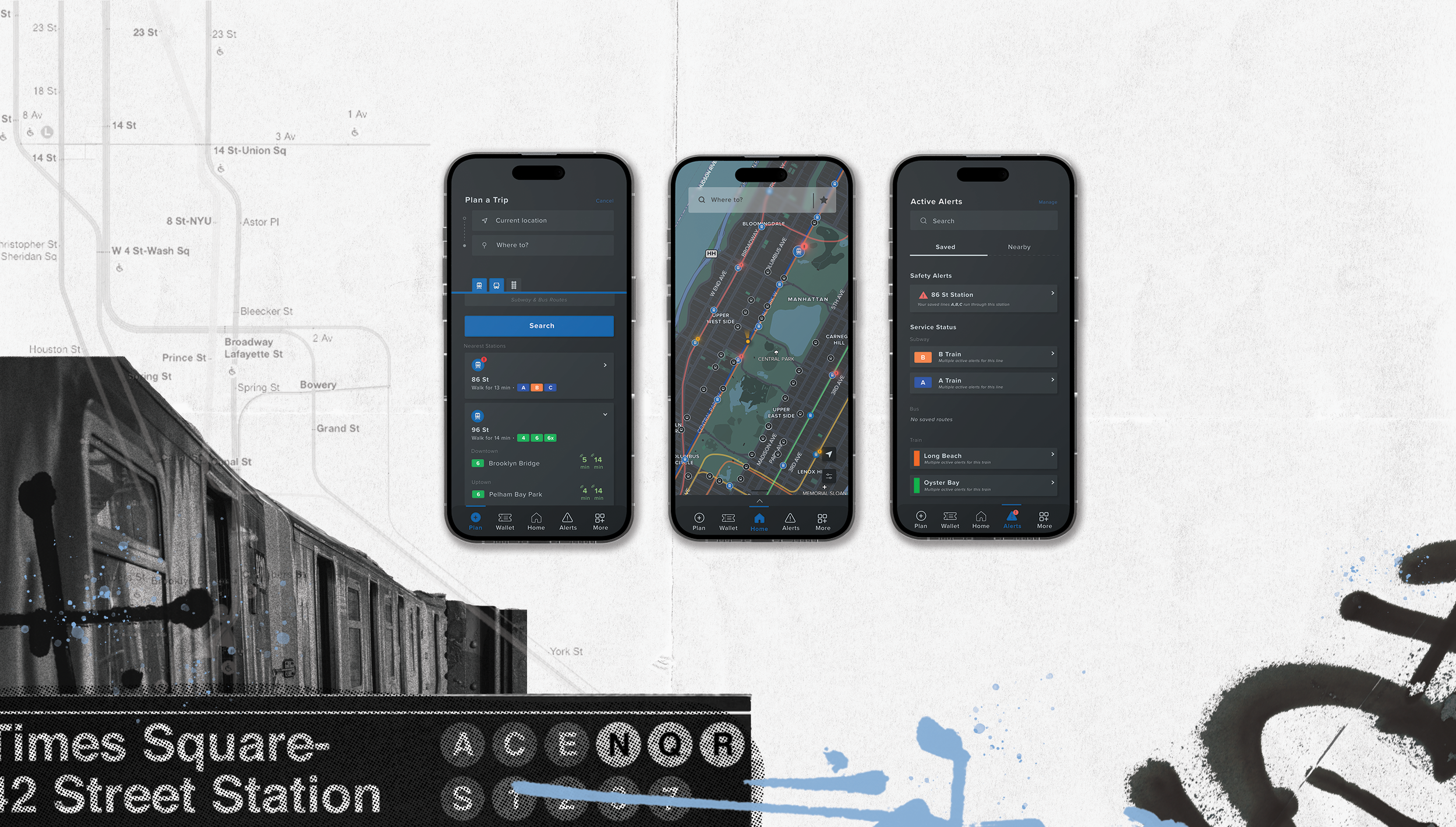
myMTA
ROLE: DESIGNER
PROJECT TYPE: MOBILE APP
Overview
With the rapid pace of urban life and the evolving needs of New York City's commuters, a seamless and intuitive app has become essential for navigating the complexities of the city’s vast public transit network. This case study explores the redesign of the myMTA transportation app, aimed at improving user experience, enhancing accessibility, and providing real-time information that empowers riders to make informed travel decisions with ease and confidence.
The main issues that were addressed with the research conducted, and creation of this app were:
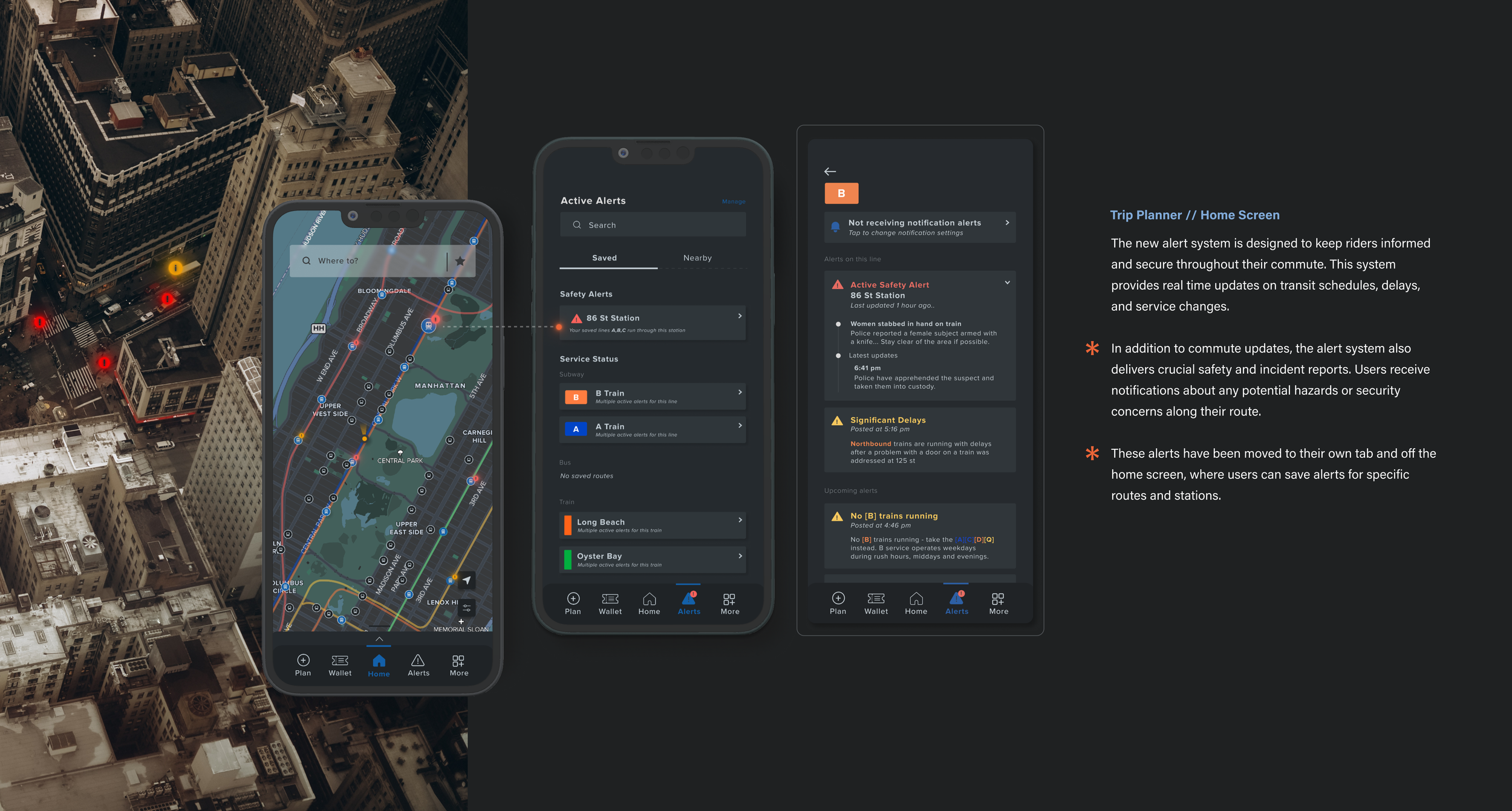
People don’t feel safe riding mass transit
The MTA has several apps that provide different functions, and it would be best to create one app that solves all problems
Give users more detailed options for travel
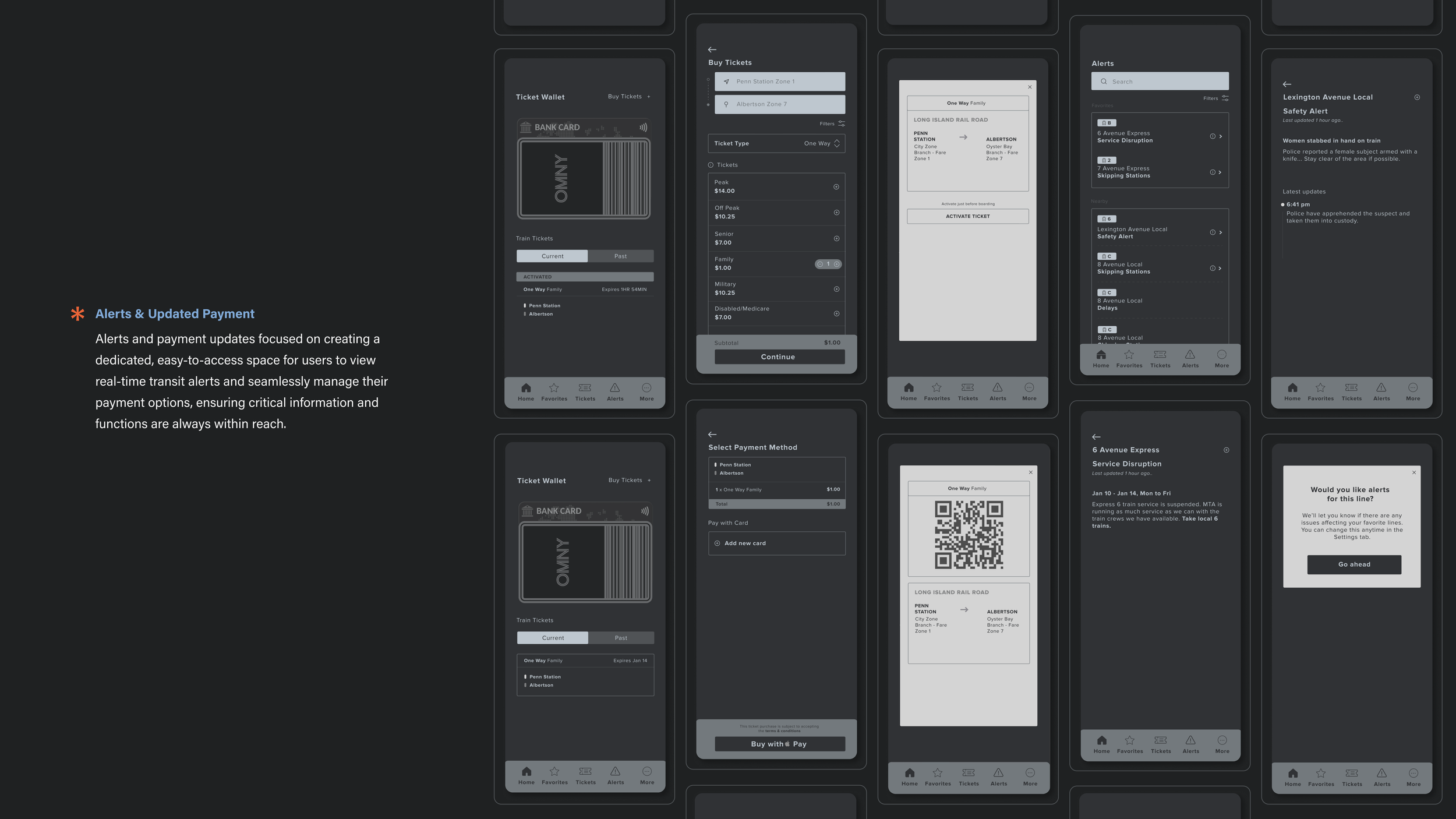
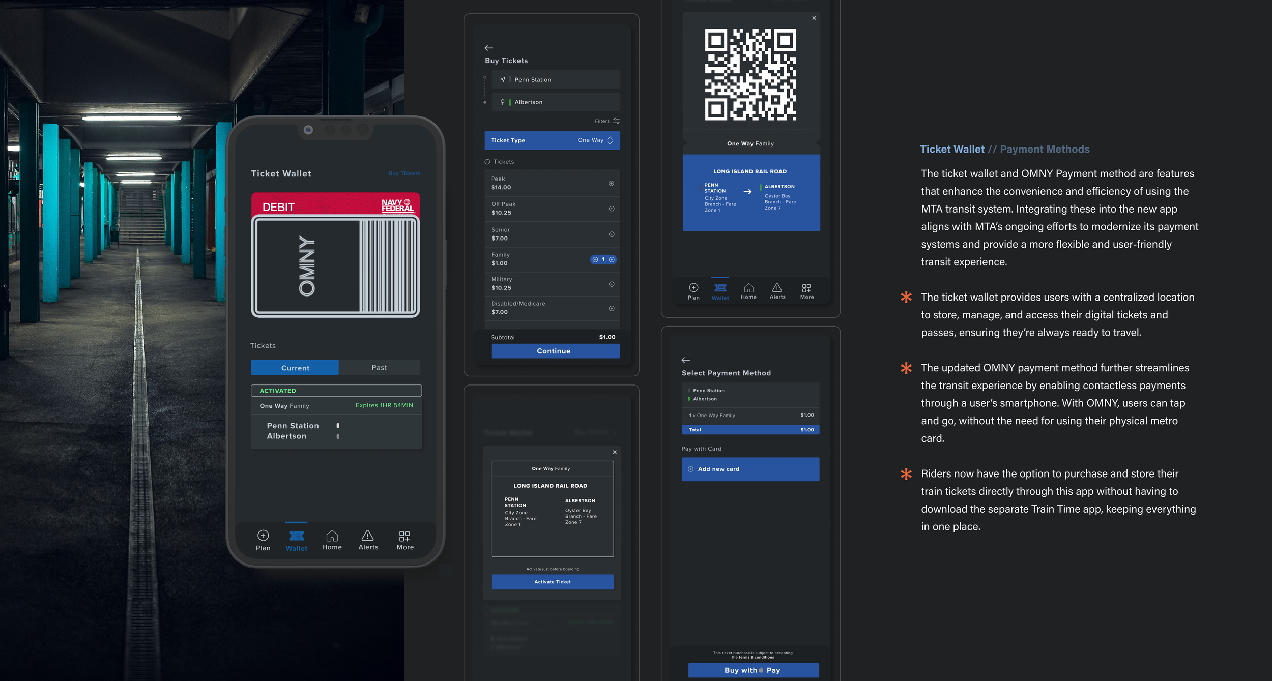
Update the payment methods
Research Goals
When thinking about the overall design and function of the app, outside of what the app was currently offering, there were goals & objectives that were initially outlined. I asked myself a series of general questions to help identify what specifics the research needed to address, and from there I could define the objectives.
Early Research Insights
What is the problem we are trying to solve?
Why are they considered to be problems?
How can we better understand the current user experience, to expand upon and fix those initial problems?
Primary Research
These research goals were to gain a comprehensive understanding of the user experience within the NYC transit system, and to identify areas for improvement that would directly inform the app’s design. Early Research Insights highlight the broad issues within the app. Specific User Research provides deeper insight into how different rider demographics interact with and perceive the transportation system. Primary Research through surveys & interviews allowed for validation of these findings, and prioritization of features that align with user needs.
How has the pandemic affected accessibility and ease of travel on the subway?
How are people currently making their travel decisions?
What tools are they using?
Specific User Research
How do users feel about the current application?
How do they feel about their travel experience overall?
How is the potential solution going to alleviate these problems?
EARLY RESEARCH
First Things First
To kick off the research phase, the current MTA app needed to be analyzed in order to identify its strengths and areas where it fell short of user expectations. This evaluation outlined some critical issues, and the start of a clear direction for improvement started to form.
One of the most notable design limitations identified in the current MTA app was the absence of a navigation bar, which created challenges for users trying to access different sections quickly and intuitively. Without a centralized navigation system, users often had to navigate through multiple screens or menus to find critical information, leading to frustration and inefficiency.
No Navigation Bar
When adding alerts, since everything is located on the home screen, it starts to become confusing. The user experience starts to become cluttered, presenting information in a way that feels overwhelming, especially without separate tabs for alerts & updates. Important notifications and real-time alerts are buried within other content, making it difficult for users to find the information they need in critical moments. And there is no clear distinction between what each alert is for, i.e. “multiple changes” vs “some delays.”
Confusing UX
The absence of a central map in the current MTA app forces users to click through multiple screens just to access basic navigation, complicating the experience and making it harder for riders to find essential route information quickly.
Lack of Central Map
When looking at the stations that are closest to you, there is no other information outside of what lines are running through that station. There are no departure times, and for someone who might be in a rush and need information quickly, this might present a few issues.
This would also pose a problem for people who are visiting and might not be familiar with how the subway system works. How are users supposed to know which direction the lines are going?
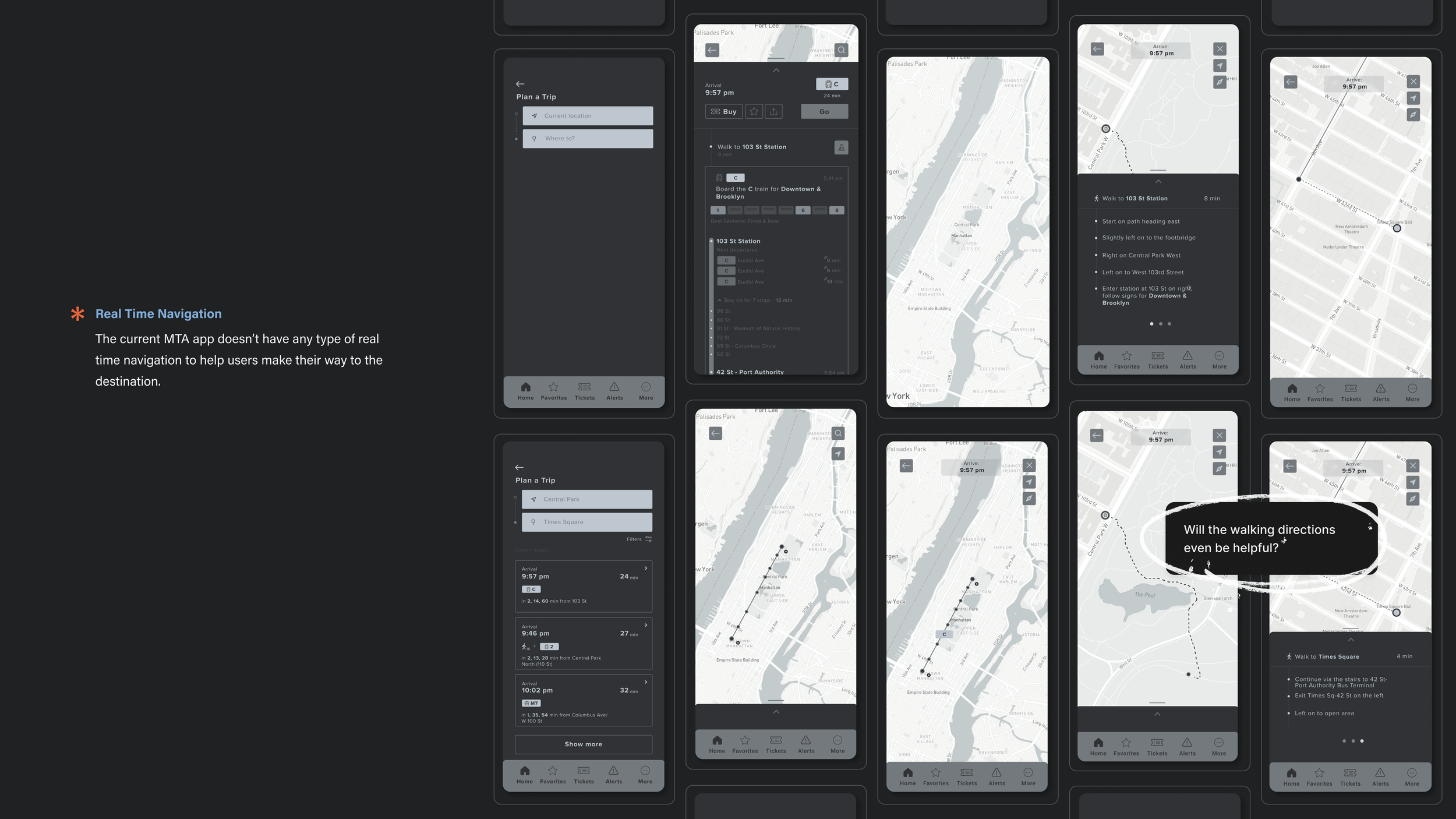
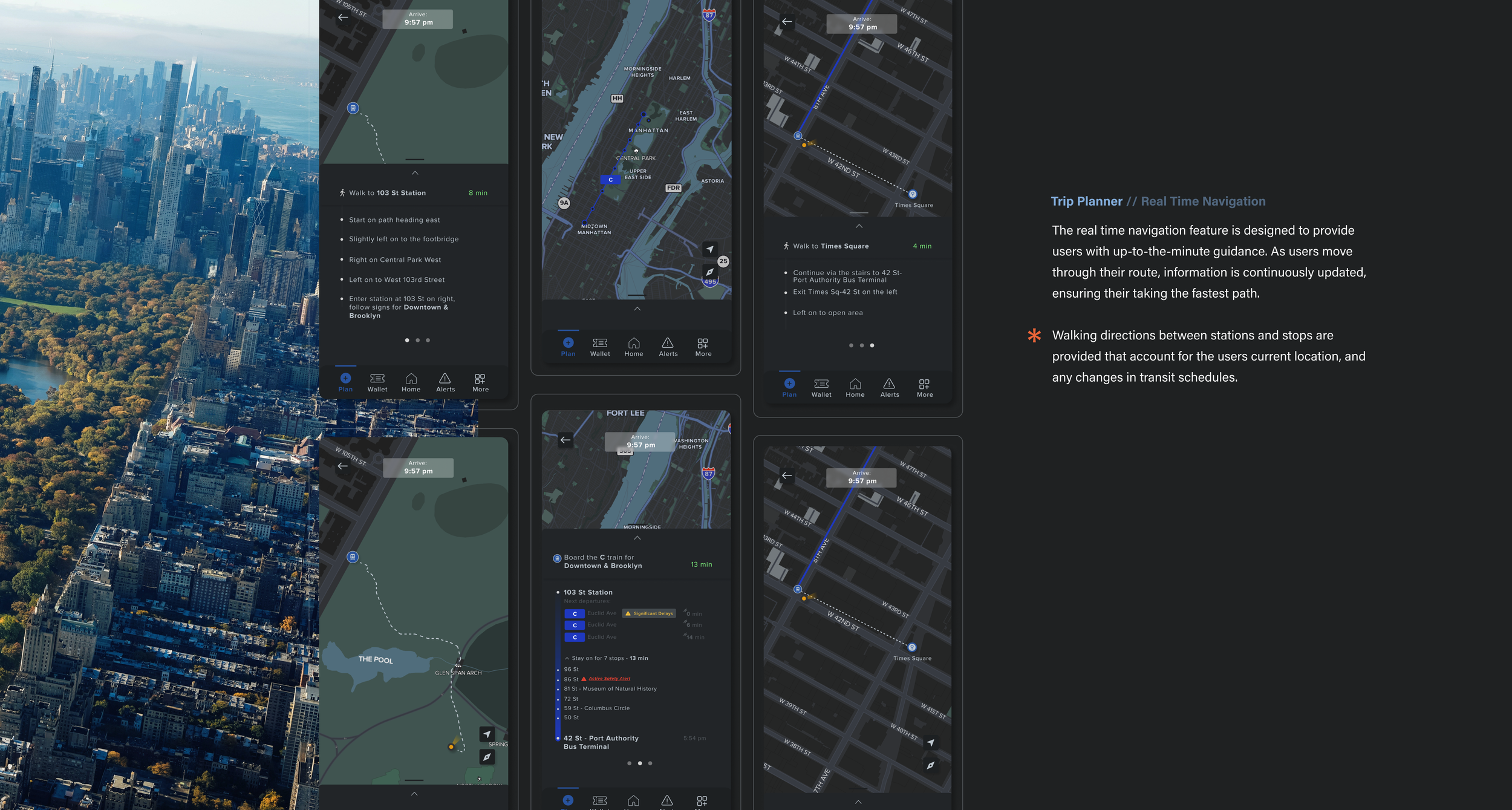
The app also does not currently have real-time navigation.
Not Enough Detailed Info
Currently, MTA does not offer electronic metro cards or any digital payment methods. Riders are still using physical metro cards, but they will soon be implementing OMNY payment, which will allow riders to use Apple Pay or their OMNY card to scan at the turnstiles.
Tickets for the railroad have to be purchased through MTA’s Train Time app (used to be MTA eTix) which operates separately from the myMTA app even though you can search and find train information on myMTA. Clicking on ‘Buy rail ticket’ opens up Train Time, adding unnecessary steps, especially if you don’t already have it downloaded.
No Payment Options
USER RESEARCH
Understanding the User
With a clear understanding of the existing app’s limitations, the next step was to dive deeper into understanding the users themselves. To create a truly effective redesign, I needed to learn more about the unique needs, preferences, and challenges faced by MTA riders. By exploring user behaviors and motivations, I could tailor the app experience to address specific pain points and enhance the overall functionality for a diverse audience of commuters, tourists, and occasional riders alike. In order to figure that out, I started with a set of questions:
Who is my ideal user?
What are their current behavior patterns?
What are their needs and goals?
What are some of their pain points?
I conducted a survey to the general public, where I was able to receive a total of 57 responses to a list of curated questions in regards to their thoughts on public transportation in NYC. Some of the most important statistics were pulled:
USER RESEARCH
Diving Deeper
To complement the direct user research, I turned to Twitter for observational studies, where MTA riders often voice their thoughts and frustrations in real-time. Analyzing these unfiltered insights from the general public, government officials, and organizations, allowed me to capture authentic, spontaneous feedback about daily transit experiences, common pain points, and frequent concerns. This social media research helped me identify recurring themes and areas of improvement, offering a broader perspective on user sentiment and providing valuable context for the design decisions in the app.
EARLY RESEARCH
Translating Insights
After gathering extensive data from user research and observational studies, I organized the findings into key categories that reflected the primary needs and challenges of MTA riders. By grouping insights into themes, I could directly link each category to potential design improvements. This structured approach allowed me to prioritize features that would have the most impact on user experience, guiding the development of intuitive, high-value functionalities tailored to rider expectations and pain points.
By putting the user insights into these distinct categories, the groundwork was laid for creating targeted app features that will help meet the needs of the MTA riders. With this as the foundation, the next step was to start looking at the overall idea for translating that information into usable features.
Potential Ideas:
Ride More Safely
Incentivize Program
Integration of Navigation System
Status Board
Impact on Design
The research conducted helped to identify the core needs and concerns of the users, which was instrumental in shaping the app. This would help to guide design choices, ensuring that the features chosen would serve a clear purpose rooted in real user experiences.
From there, I was able to brainstorm some application ideas that I thought would best be able to tackle multiple issues at one time, especially since they weren’t being addressed in the current applications. I knew that not every single issue was going to be fixed, but the goal was to try and choose problems that were more so related to each other, and could be combined into major features for the app.
Create a citizen-type app where riders can post real-time video content of ongoing crimes that alerts all riders who have downloaded the app.
A loyalty program that rewards users for purchasing rides, weekly or monthly passes, and rewards them with cash back options, deals to brands or restaurants, or giveaways of free rides when they accrue X amount of points.
Include a navigation system that provides real time directions and updates so users will be able to get to where they’re going.
Would show status updates of the stops further down the line. You would be able to see if there were any reported incidents on the rest of your trip.
INSIGHTS
Ideation Phase
The ideation phase focused on transforming the research insights into actionable features that would address the most critical needs of MTA riders. To ensure I prioritized the features that would add the most value, I employed a task prioritization chart. This tool helped me weigh each potential feature based on its impact, feasibility, and alignment with user needs. By organizing and evaluating the ideas in this structured way, I could make informed decisions about which functionalities would be essential to the user experience, allowing me to focus on delivering a well-rounded, efficient, and user-friendly app.
LOFI WIREFRAMES
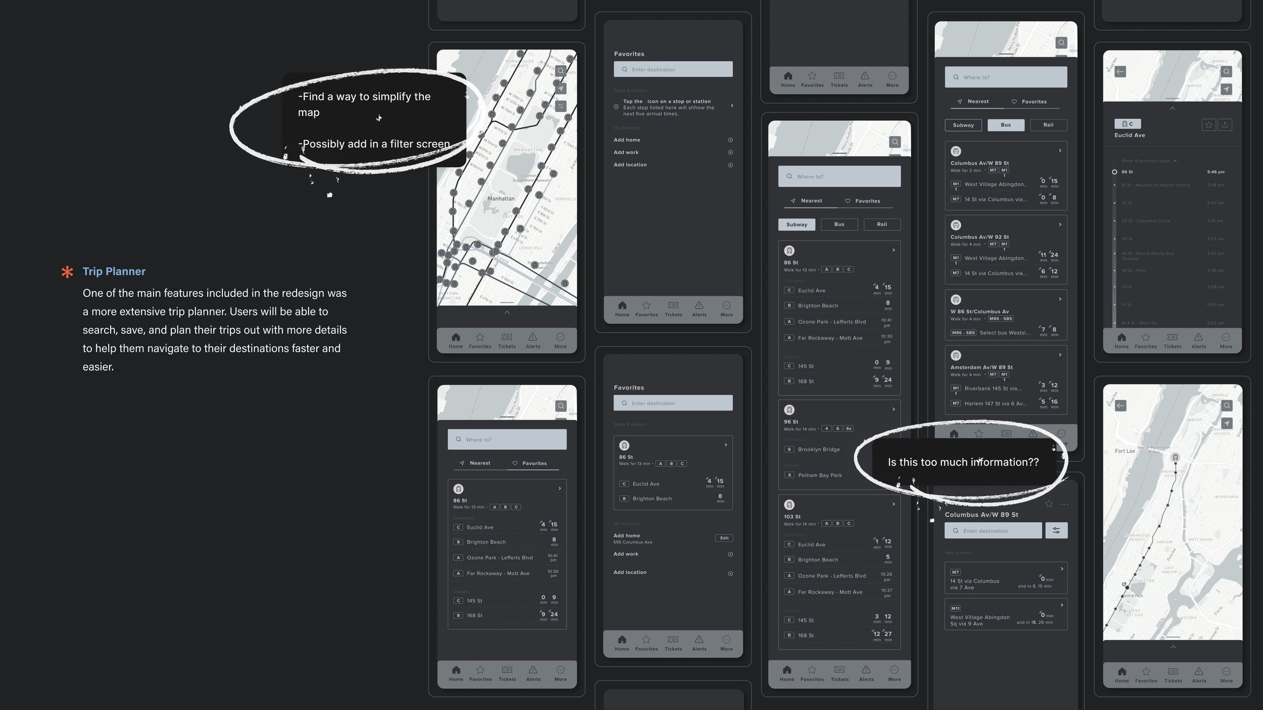
With a better understanding of the essential features that will drive the core functionality of the app, I could start building out the initial wireframes. Here, I can visualize how these features will start to come together in a user friendly interface. Some thoughts while building are included below:
With a clear understanding of prioritized features from the ideation phase, we began sketching initial concepts through low-fidelity wireframes. These early wireframes served as a blueprint, allowing us to map out the core structure and flow of the app without getting caught up in visual details. By focusing on layout and functionality first, we could quickly iterate on design ideas and validate the placement of key elements like navigation, maps, and alerts. This process set the stage for a more intuitive interface and provided a foundation for feedback before moving into higher-fidelity designs.
HIFI Wireframes
With a clear understanding of prioritized features from the ideation phase, I began sketching initial concepts through low-fidelity wireframes. These early wireframes served as a blueprint, allowing me to map out the core structure and flow of the app without getting caught up in visual details. By focusing on layout and functionality first, I could quickly iterate on design ideas and validate the placement of key elements like navigation, maps, and alerts. This process set the stage for a more intuitive interface and provided a foundation for feedback before moving into higher-fidelity designs.
USABILITY TESTING
What Do the Users Think?
With the final designs in place, I moved into the usability testing phase to validate the design choices and ensure the app met user expectations. This phase focused on observing real users as they interacted with the app, gathering feedback on navigation, feature accessibility, and overall experience. Usability testing allowed me to identify any remaining pain points and make necessary adjustments.
Final Design
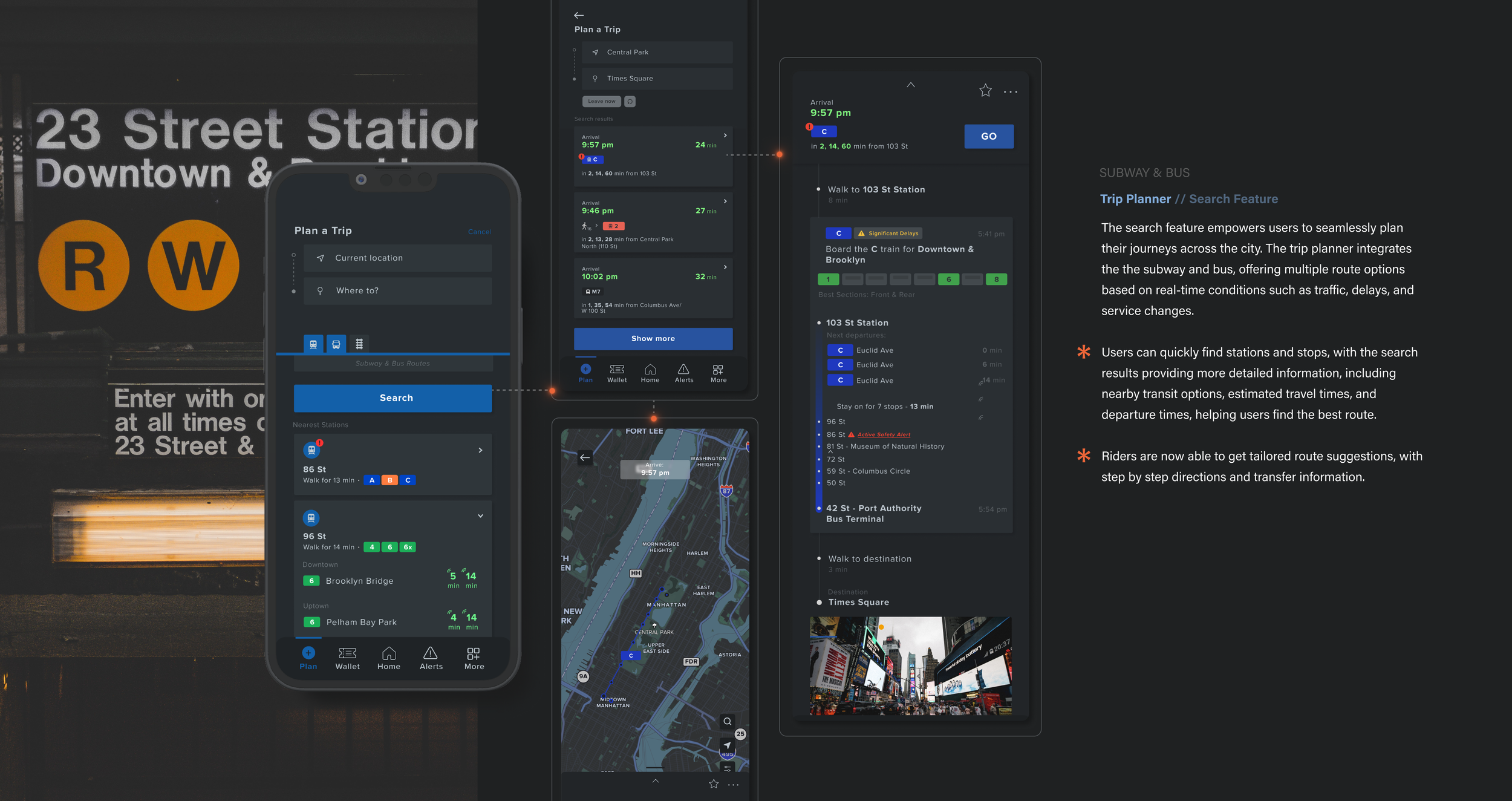
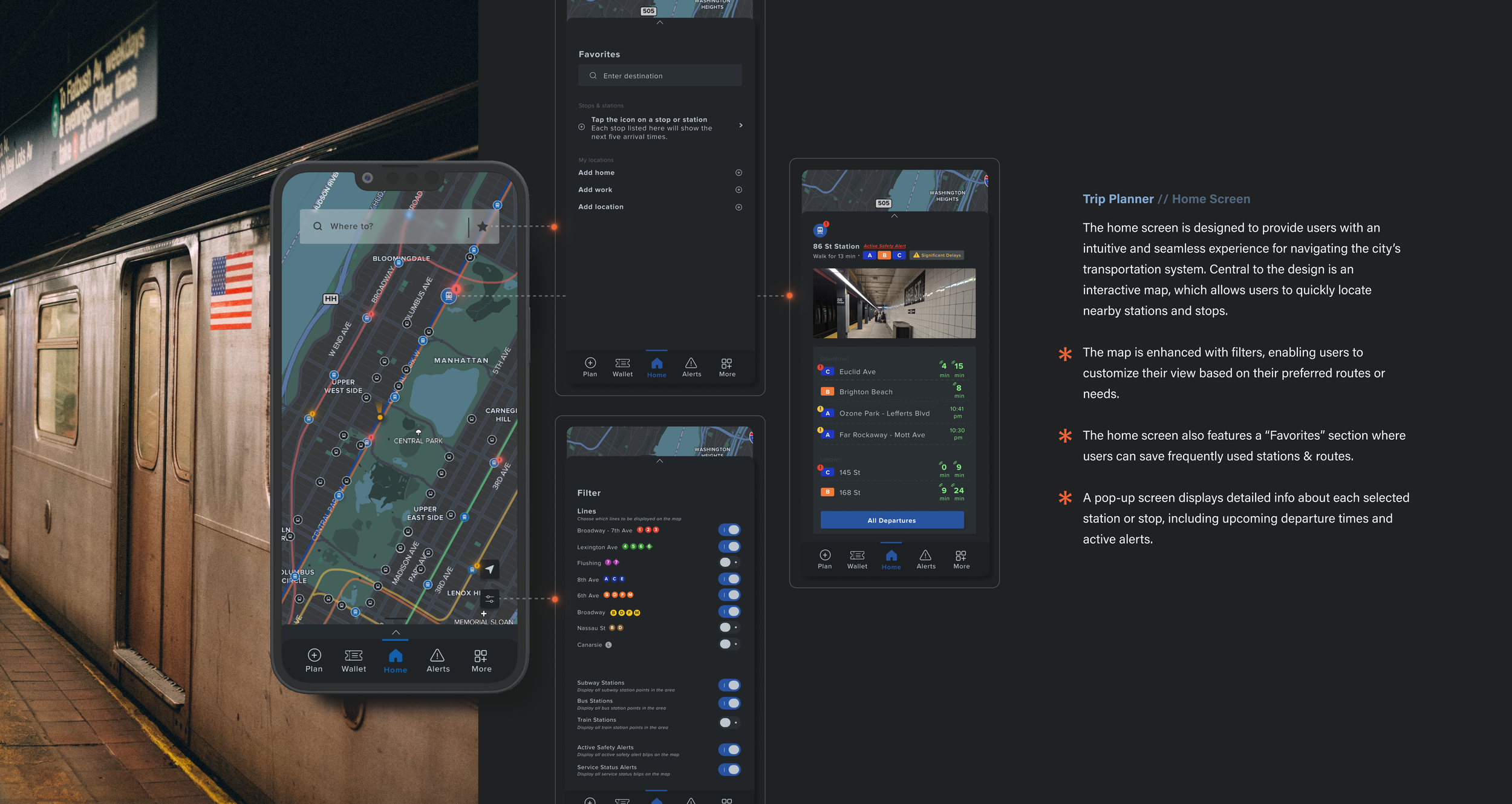
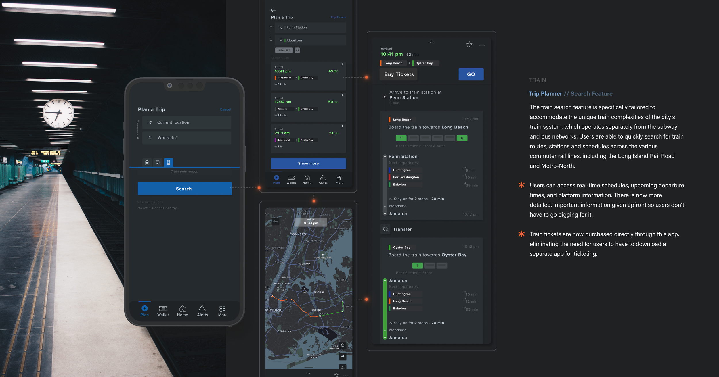
The final designs bring together all the insights, feedback, and iterative improvements from previous phases, resulting in a polished, user-centered app experience. Each element has been carefully refined to address the core needs of MTA riders. These high-fidelity wireframes showcase the app's streamlined layout and visually accessible design, ensuring that users can easily find information, track routes, and manage their journeys efficiently. The final design embodies our commitment to enhancing the transit experience for all riders in NYC.
Trip Planner // Home Screen
Este formulario de registro es para la comunicación del rol de recolector de datos. La inscripción no requiere participación. Al registrarse a través de este formulario, acepta recibir correos electrónicos informándole de los pasos y plazos importantes asociados con ser un recolector de datos de ES. Puede optar por no recibir correos electrónicos en cualquier momento después de registrarse comunicándose con Outreach@ArisaLab.org.
Este registro también es para personas que participaron como recolectores de datos de ES en 2023 para el eclipse anular y estén interesados en participar nuevamente para el eclipse solar total de 2024.
La recopilación de datos ES requiere equipo. Este registro es para la comunicación
Trip Planner // Search Feature
Este formulario de registro es para la comunicación del rol de recolector de datos. La inscripción no requiere participación. Al registrarse a través de este formulario, acepta recibir correos electrónicos informándole de los pasos y plazos importantes asociados con ser un recolector de datos de ES. Puede optar por no recibir correos electrónicos en cualquier momento después de registrarse comunicándose con Outreach@ArisaLab.org.
Este registro también es para personas que participaron como recolectores de datos de ES en 2023 para el eclipse anular y estén interesados en participar nuevamente para el eclipse solar total de 2024.
La recopilación de datos ES requiere equipo. Este registro es para la comunicación
Trip Planner
Este formulario de registro es para la comunicación del rol de recolector de datos. La inscripción no requiere participación. Al registrarse a través de este formulario, acepta recibir correos electrónicos informándole de los pasos y plazos importantes asociados con ser un recolector de datos de ES. Puede optar por no recibir correos electrónicos en cualquier momento después de registrarse comunicándose con Outreach@ArisaLab.org.
Este registro también es para personas que participaron como recolectores de datos de ES en 2023 para el eclipse anular y estén interesados en participar nuevamente para el eclipse solar total de 2024.
La recopilación de datos ES requiere equipo. Este registro es para la comunicación
CHALLENGES
What I Learned
This project reflects the broader challenges of designing digital solutions for large-scale, complex systems, where the intersection of design, technology, and user experience must be navigated with precision and creativity. Ultimately, it’s about transforming a challenging design problem into a user-centered solution that meets the needs of one of the most dynamic and demanding transit systems in the world.
Complex User Needs
The MTA services over 3 million people every single day, making it one of the busiest transit systems in the world. Catering to the needs of so many different people presented a significant challenge when trying to figure out what would be the most important, and most useful.
Learning a New System
The MTA's vast and intricate network of subway lines, bus routes, and express services can be difficult to grasp without prior knowledge or experience. Understanding the complexities of the transit system—how different lines connect, how schedules fluctuate, and how riders navigate through it—is crucial to creating a functional and intuitive app. And it becomes a challenge when you have no first hand experience.
Creating Intuitive UI
Designing an interface that is easy to navigate, especially for first-time users or tourists that are not familiar with the city or transit system was crucial. The challenge laid in presenting complex information — such as multiple transit options, routes, and real time updates — in a way that’s simple and not overwhelming.
REFLECTION
Designing and creating this app had been a multifaceted challenge that required careful consideration of research, user needs, and design elements. The complexity of the MTA system coupled with the diverse needs to millions of users, made this project uniquely demanding. The design process presented itself with multiple challenges, to balance simplicity with functionality matched with managing visual hierarchy. Despite those challenges, the potential impact of having a well designed app is immense. By making the MTA system more accessible and intuitive, the app could significantly enhance the commuting experience for New Yorkers and visitors alike.


